The Da Vinci Code
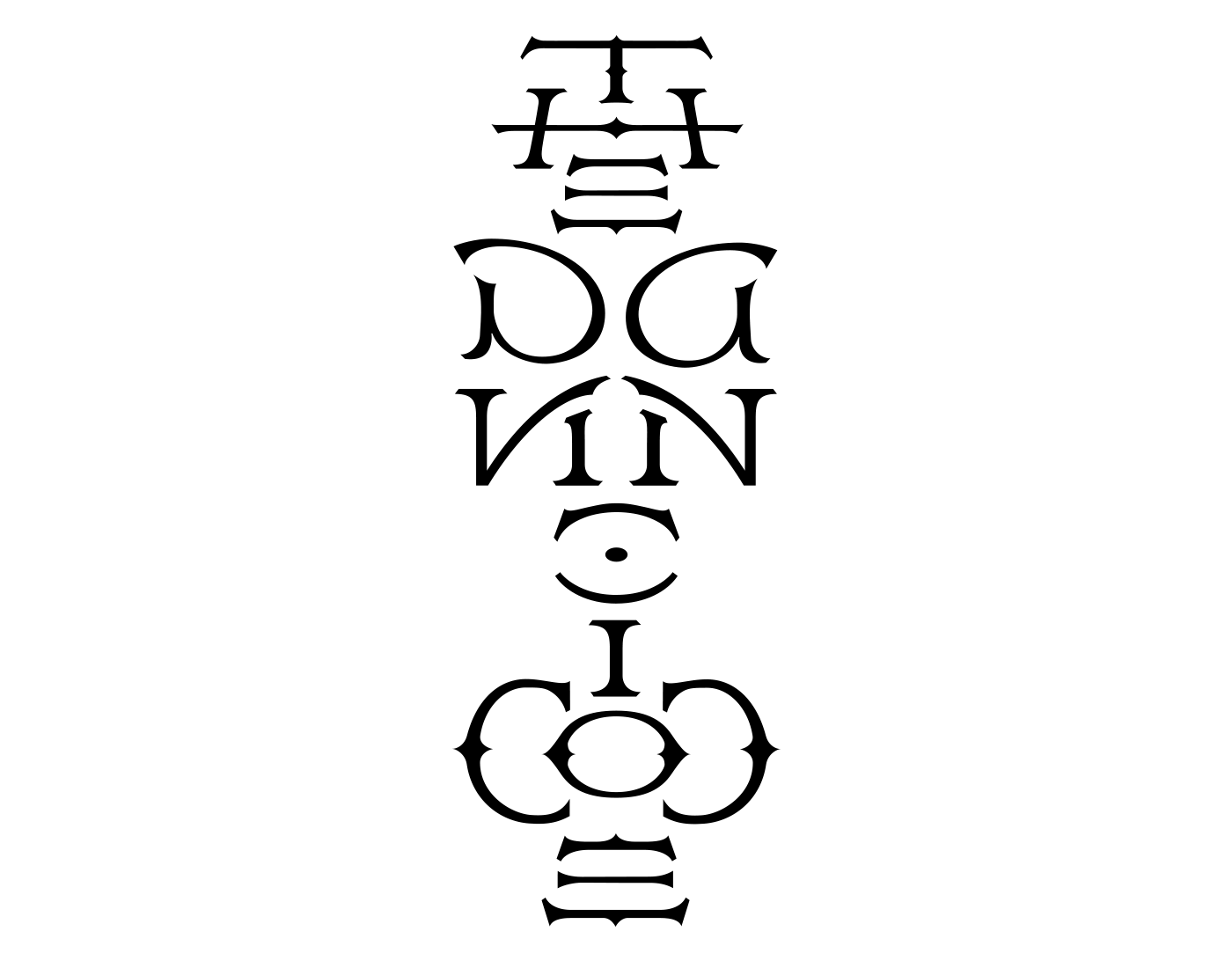

Early in 2005, it occurred to me that a movie version of The Da Vinci Code would need graphics that the book had not needed. Having created the ambigrams for Angels & Demons, I thought it would be fun to contribute something special for Dan Brown’s other Robert Langdon novel. I discussed the idea with Dan, and he told me that they would need a logo for the Depository Bank of Zurich (shown at right). I mentioned that I would love to create opening title credits and Dan said that while he could not guarantee that they’d be used, he would certainly get the right people to take a look at whatever I came up with.
I worked with a very talented student at the Antoinette Westphal College of Media Arts & Design at Drexel University. When I met Digital Media major Steve Viola, he had recently returned from a co-op position with Universal Studios in Los Angeles, where he had worked on trailers for Universal’s movie releases. His abilities and experience were exceeded only by his enthusiasm.
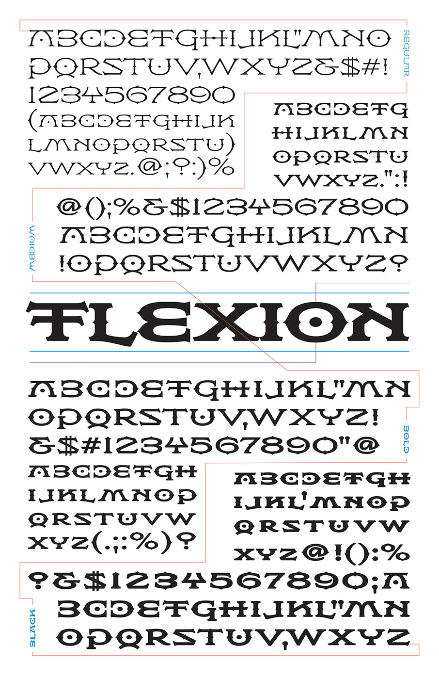
If my ambigrams would be used in The Da Vinci Code’s opening title sequences, it would be great to have a matching font for the “crawl” at the end of the movie. My associate, Hal Taylor was enthusiastic about the project, and based on about a dozen letters that I had developed for the totem ambigrams, he created not just one font to match the totems, but a full family of four weights. The family, named for its genesis in mirror-image symmetry, is called Flexion. Neither the title videos nor the font were used in the film. The font is available for purchase at Veer.
