Flexion Typeface
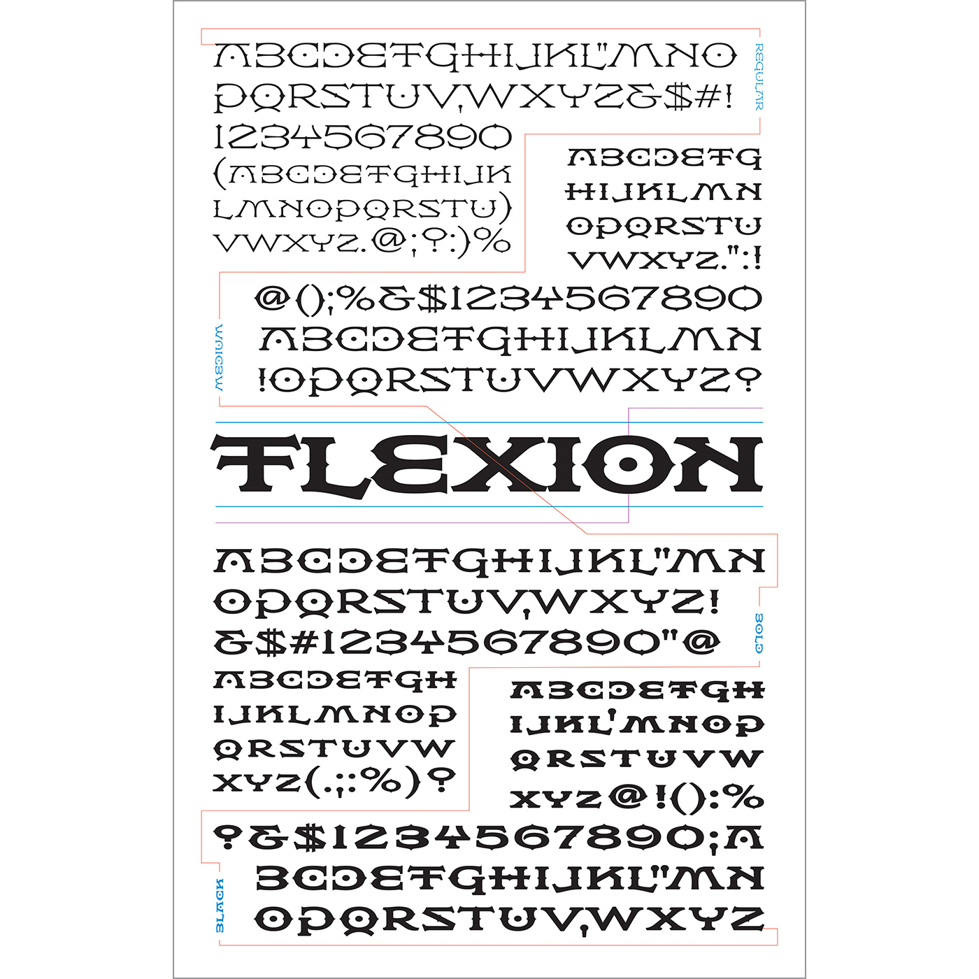

The underlying principle in the design of Flexion (pronounced “fleck-shun”) is mirror-image symmetry, which occurs naturally in the structure of eleven capital letters in the Roman alphabet. Another few letters have been coaxed into adopting that symmetry, while others find their reflected counterparts elsewhere in the alphabet. Flexion was developed in 2005 for the DaVinci Code movie titles, but was not used. Flexion is a caps/small caps font, with no lower case. It is available from Veer, and other font distributors.
PURCHASE TYPEFACE FROM VEER
